ELPHI


Overview
How do we help borrowers apply for mortgages online?
The Project
Elphi is a SaaS fintech startup streamlining the mortgage origination process.
They tasked my team of 3 to redesign their white-label point-of-sale (POS) system product demo for lenders to help borrowers apply for mortgages online.
Duration
3-Week Design Sprint
Tools
Sketch
Axure RP
InVision
Zeplin
Pen and Paper
My Role
On a team of 3 designers, I:
-
Conducted UX research including 3 user interviews, 5 card sorts and 3 rounds of paper prototype tests.
-
Wrote usability test plan and conducted 5 rounds of usability tests with mid-fidelity wireframes.
-
Managed the project timeline, organization and kept track of key deliverables.
-
Presented our research and design process to stakeholders and engineering team.
-
Informed all stages of the research and design process, including stakeholder meetings, competitive analysis, design studio, low-fidelity wireframing, and hi-fidelity iterations.
The Problem
Elphi did not have a compelling product demo to show potential investors.
Their existing product demo was also not based on user research and was not competitive with other POS systems in the mortgage space.
The Solution
My team of 3 designed a point-of-sale product demo that allowed mortgage loan borrowers to apply for loans and calculate their rates online.
The demo simplified the paper application form for users and reduced the number of clicks users had to go through compared to Elphi's competitors.

Overview
UX Process
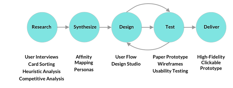
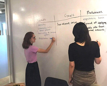
Stakeholder Research
What are our business considerations?
Customers
Elphi is selling their POS software to lenders, which include:
-banks
-credit unions
-depository lenders
The POS software needs to be customizable for each lender and easy and attractive to use as lenders are all competing for mortgage buyers.
Product Constraints
-
Elphi had existing screens from their UI designer but they were not backed in user research.
-
Industry highly regulated by Frannie and Freddy. Everything that is collected by the lender has to go into the 1003 Form
-
Elphi's developers already had begun coding the product based on initial designs, so our team needed to consider the work that had already been done for the project.
Competitors
Elphi differentiates itself by using open API and blockchain technology to provide a secure history of transactions.
However, they compete with both banks and other SaaS companies that provide similar mortgage origination POS software.
We needed to design a product that could compete in terms of simplicity of use and visual appeal.
Product Goals
-
Minimize number of clicks someone has to go through to complete the mortgage application form
-
Have a mortgage calculator where users can put in different numbers to see different rates
-
be answer-responsive - the form would adapt according to how users answer different questions
-
Have menu where you can go back and edit
Competitive Analysis
What features do we need?
We compared:
-
Form interface
-
Mortgage calculator
-
User flows
Key features needed:
-
Menu to orient users
-
Friendly language
-
Conditional questions

We compared features across 3 POS systems that are similar to Elphi's. We used Neilson's 10 usability heuristics as well as features we identified as important from our discovery research. We then decided which key features we needed based on our findings.
User Interviews
How do borrowers apply for mortgages online?
We wanted to speak directly to users who had applied for mortgages to understand the following:
-
Whether they had applied online and/or offline for a mortgage and/or refinance
-
How they felt about the mortgage application process
-
How they approached the mortgage application process
-
Example questions I asked were how much research they did and whether they completed the process in one sitting.
-
“When I think about making a big purchase...I want to understand what I'm committing to.”
“The application process took longer than I expected, it should have been more automated.”
“The process was a lot of waiting, we had to mail or fax forms, and then wait to get things back.”
I conducted 3 of the 9 user interviews.
We interviewed users who were:
Between ages 28-65
Middle and upper class
After sharing my findings with my team members, we came up with some key takeaways:
-
They use mortgage calculators to research rates
-
Want a reputable bank
-
Find out lender information from personal network and/or agent
-
Are cautious about personal information online, but to different degrees
Synthesizing our interview findings to create personas.
Personas
Who are the primary and secondary users?
Primary Persona
Secondary Persona


Alex
Jordan
Jordan is ready to apply for a mortgage. They've chosen an online application for its convenience.
Situation
Goals & Needs
An easy-to-use and efficient application process
Low/competitive interest rates and packages
Alex is starting the process of purchasing a home and is exploring their options.
Seeking knowledge about application and loan process
A calculator to compare rates and mortgage packages
Preferences &
Pain Points
Reputable bank
Worried about security
No direct communication with a loan officer during the application process
Skim over content
Wants to understand what information is needed to apply for a mortgage and why it's necessary
Card Sorting
How do borrowers organize information?
I conducted 4 of 9 rounds of closed card sorting to understand how borrowers expected to fill out the mortgage application form.
We broke up the 1003 Uniform Residential Loan Application into 13 cards that covered the major sections of the form as well as 1 card for social security and date of birth, which we wanted to test specifically.
-
Property information
-
Veteran status
-
Contact Info
-
Marital status
-
Purchase, down, and loan payment
-
Bank info
-
Income
-
Declarations (violations against you)
-
Citizenship status
-
Purchase or refinancing?
-
Demographic info
-
Address history
-
Do you own any real estate?
-
SSN + DOB

The 1003 Uniform Residential Loan Application Form that lenders must submit with borrowers' information.
Key takeaways:
-
Users organized questions into ones that were easy to answer and ones they’d need more time on.
-
Users expected to be asked for their SSN despite our assumptions from our background research and competitive analysis that users might be sensitive about putting in that information online.

Round 1 of 9 card sorts we conducted to understand how users organized information on the 1003 form.
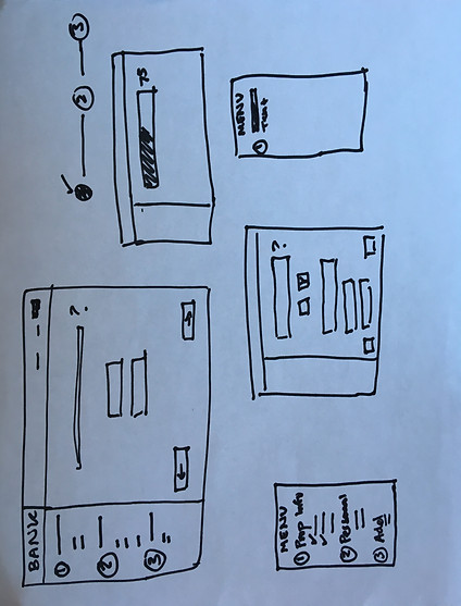
Paper Prototype Testing
We took our card sorting results and synthesized them along with the flow of the existing application form as well as our competitors flow to come up with 3 main sections of the form:
-
Property information
-
Personal Information user can complete quickly
-
Personal Information that the user needs more time to answer
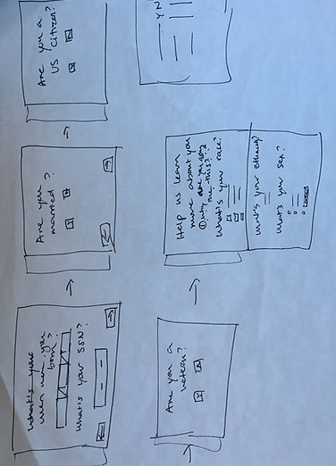
I conducted all 6 rounds of paper prototype testing with my teammate to understand the order of questions users expected to be asked on each of the 3 sections of the form.

Our paper prototype for the application form.
Key takeaways:
-
Users were expecting to have to fill in a lot of information. This showed that they were comfortable with the number of questions we put in each section
-
Users grouped all demographic questions together, different from how they are distributed on the form.

1 of 6 participants who tested our paper prototype.
User Flow

The complete user flow starting at the mortgage home on lender site to completing form and returning to user dashboard.
Design Studio
Designing an intuitive and simple form
In order to begin the design process, we conducted a design studio to ideate different design solutions and converge as a team.
Round 1: 5-minute sketch of my solution for form, including menu, progress indicators, and question layout.
Round 2: My second 5-minute solution after pitching my initial sketch to team.

Usability Testing
What changes do we need to make to our designs?
I brought the second half of our flow into mid-fidelity wireframes.
I wrote the usability test plan and conducted 4 rounds of usability tests on the mid and hi-fi wireframes. I wanted to test:
User Orientation
-
Whether users could tell where they were throughout the form
Language
-
Whether users could understand the language of what they were being asked
Length
-
How confident users felt about their ability to complete the form
We also tested Elphi's existing designs for the POS homepage and mortgage calculator and redesigned them to make them more eye-catching and competitive.
Iterations
Language
Assets Page
Assets Page

Round 1
Users noted that they might need more information about words such as "assets" or "liabilities."

Round 2
I added further explanation for users that might need examples of what the form was asking.
Language Preference Page
Language Preference Page
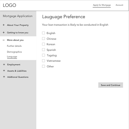

Round 1
Originally we used the 1003 form's statement that "your loan transaction is likely to be conducted in English" on our wireframe.
Users were confused as to whether language preference meant the form would be in a different language.
They also felt the tone was not friendly.
Round 2
I changed the language to be more friendly and to reflect that the language option referred to the part of the process after the user completed the form.
Iterations
User Orientation
Loan Details
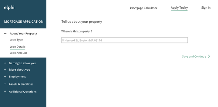
Round 2
Users did not understand the green underline indicated they were in that section of the form.
While they liked the friendly language of the section header "Tell us about your property," it did not help orient them because it did not match the section name of the menu, "Loan Details."
Loan Details

Round 3
We bolded the side menu section and top navigation menu section the user was on and added a checkmark to the side menu to indicate the user had completed the previous section.
We added a smaller header to match the menu section the user was on that users said helped orient them and kept the page header so the form would remain friendly to its users.
Iterations
Homepage
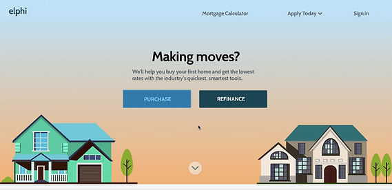
Existing Mortgage Homepage
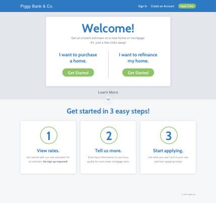
Mortgage Homepage Redesign

V1
V2
Existing draft of Elphi's UI designer's POS homepage.
We redesigned the top half of the homepage to direct our primary persona to either purchase or refinance the bottom of the homepage for our secondary persona to understand Elphi's points of differentiation.
Iterations
Mortgage Calculator
Existing Mortgage Calculator

V1
We usability tested the existing draft of Elphi's mortgage calculator.
Users liked the sliding scale for estimating credit score but didn't need to estimate purchase price or down payment.
Mortgage Calculator Redesign
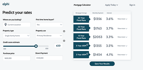
V2
We redesigned the calculator to fit onto one page without scrolling.
We put purchase price and down payment as a form field rather than a scale.
We also replaced "Get started" with "save your results" to better address the needs of our secondary persona who wants to calculate their results but isn't ready to apply.
Saving their results doesn't pressure them to begin the application process but incentivizes them to return to that lender when they are ready as they have already started an account.
The Solution
A simplified and intuitive form
Takeaways
What did I learn?
Working with developers
-
I presented our UX process to Elphi's team of engineers and was able to understand further about their technical constraints and answer questions they had about the research and design process.
Timing
-
There's a tricky balance between testing mid-fidelity wireframes and going into high fidelity. We moved to high fidelity before we were able to apply all of the changes from our usability test results, and ended up doing more work in high fidelity to change language and orientation.
Client buy-in
-
Elphi initially wanted us to spend less time on research and focus on UI. I presented Elphi's CEO and COO with our research findings and explained the value of talking directly to their users.
-
At the end of the project, Elphi informed us that they thought the research behind the design increased the quality of the product and would also help them differentiate their product when pitching it to potential clients. This was a gratifying win!
Next Steps
1. Interview lenders to understand their needs:
How will the POS integrate with their existing site and system?
What customization do lenders need on the POS?
What questions do lenders prioritize on the 1003 form?
2. Build out the POS on mobile so users can calculate rates on-the-go and access their account dashboard.
3. Finish building out the refinance and co-borrower flows.
I had begun building out different wireframes for users applying to refinance and applying with a co-borrower and was able to work with the COO on designing that flow.
We only needed to deliver one flow to the client so I did not prioritize the additional flows, but in the future would conduct usability tests with the additional flows and bring them to hi-fidelity.
Check out my other work